Earthling wine brand design
Branding art and design for New Zealand wine, named Earthling. We worked on everything from naming, design, and illustration to the AR component of this project.
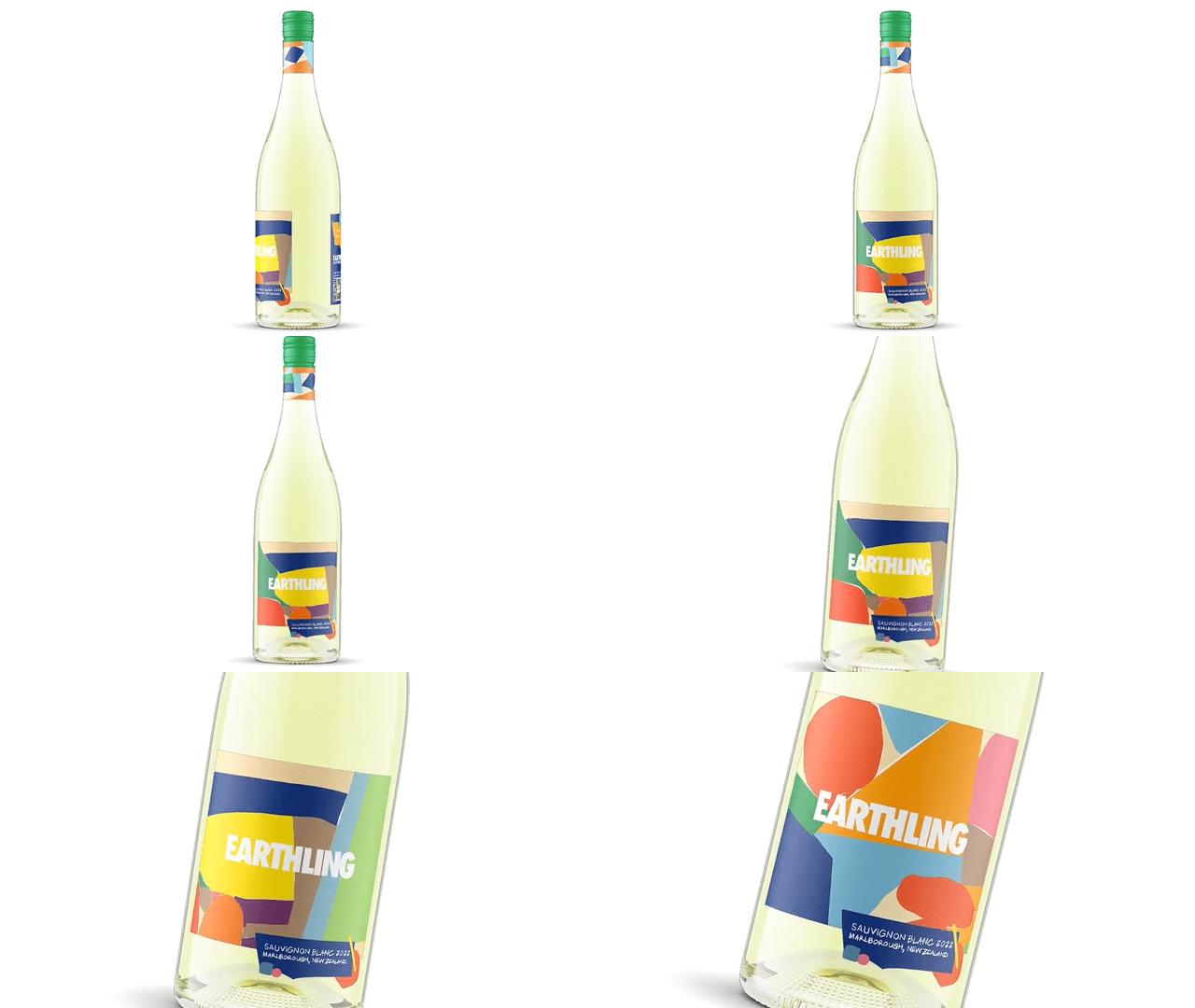
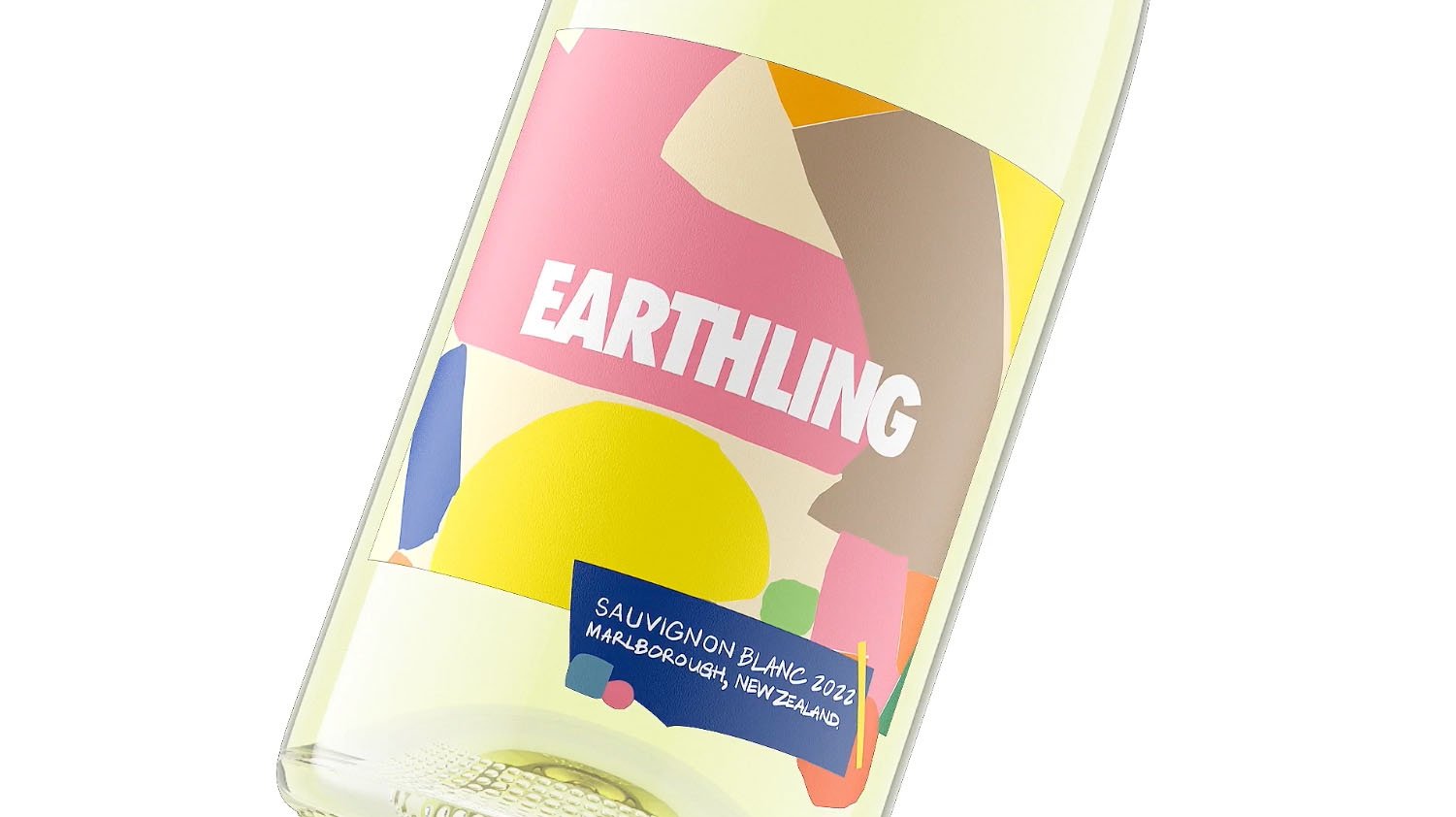
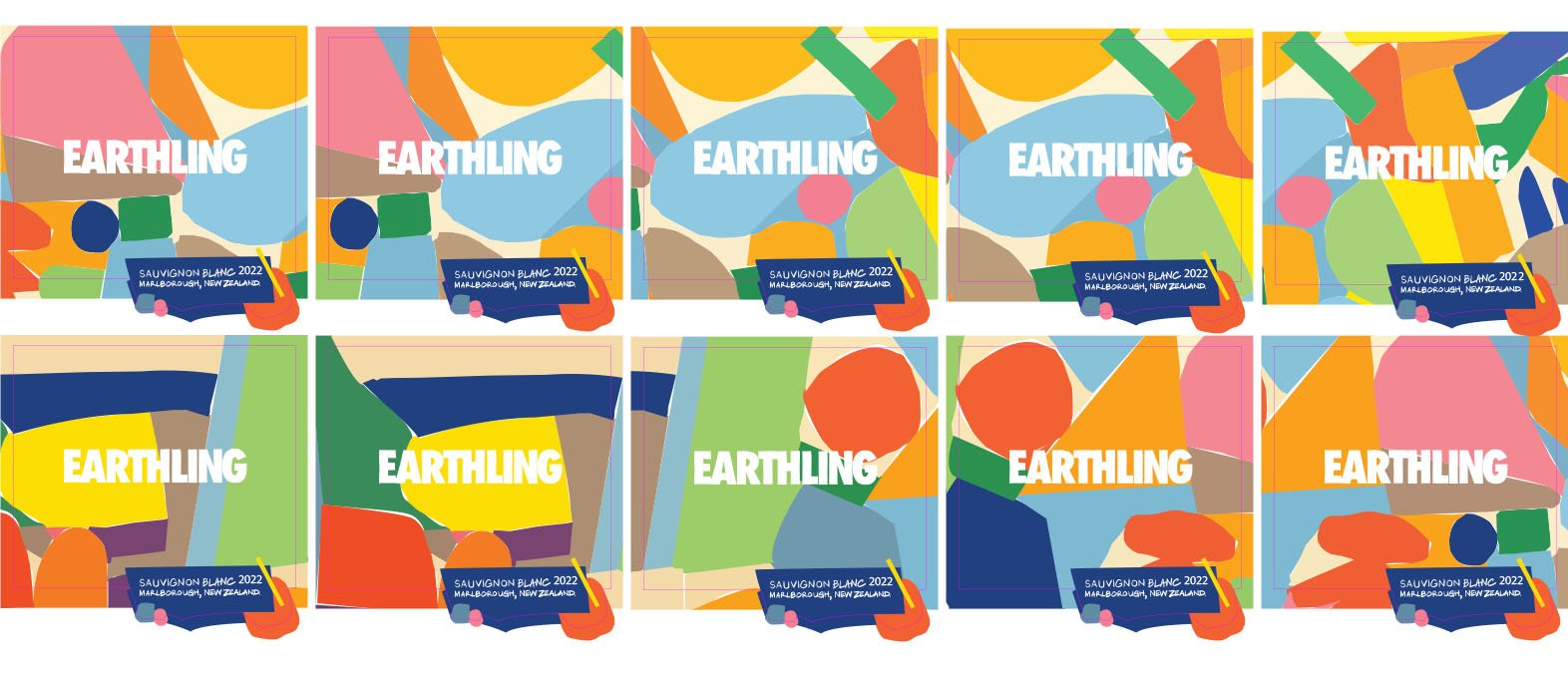
This branding art and design project stands out with its unique approach to labeling. Each label is one-of-a-kind, created from a panoramic art piece made by hand. The design extracts shapes and colours from the masterpiece, resulting in a set of playful characters that reflect the diverse nature of humanity. Embrace individuality an innovative and eye-catching branding solution.

Earthling Wine package design

Master panoramic design.
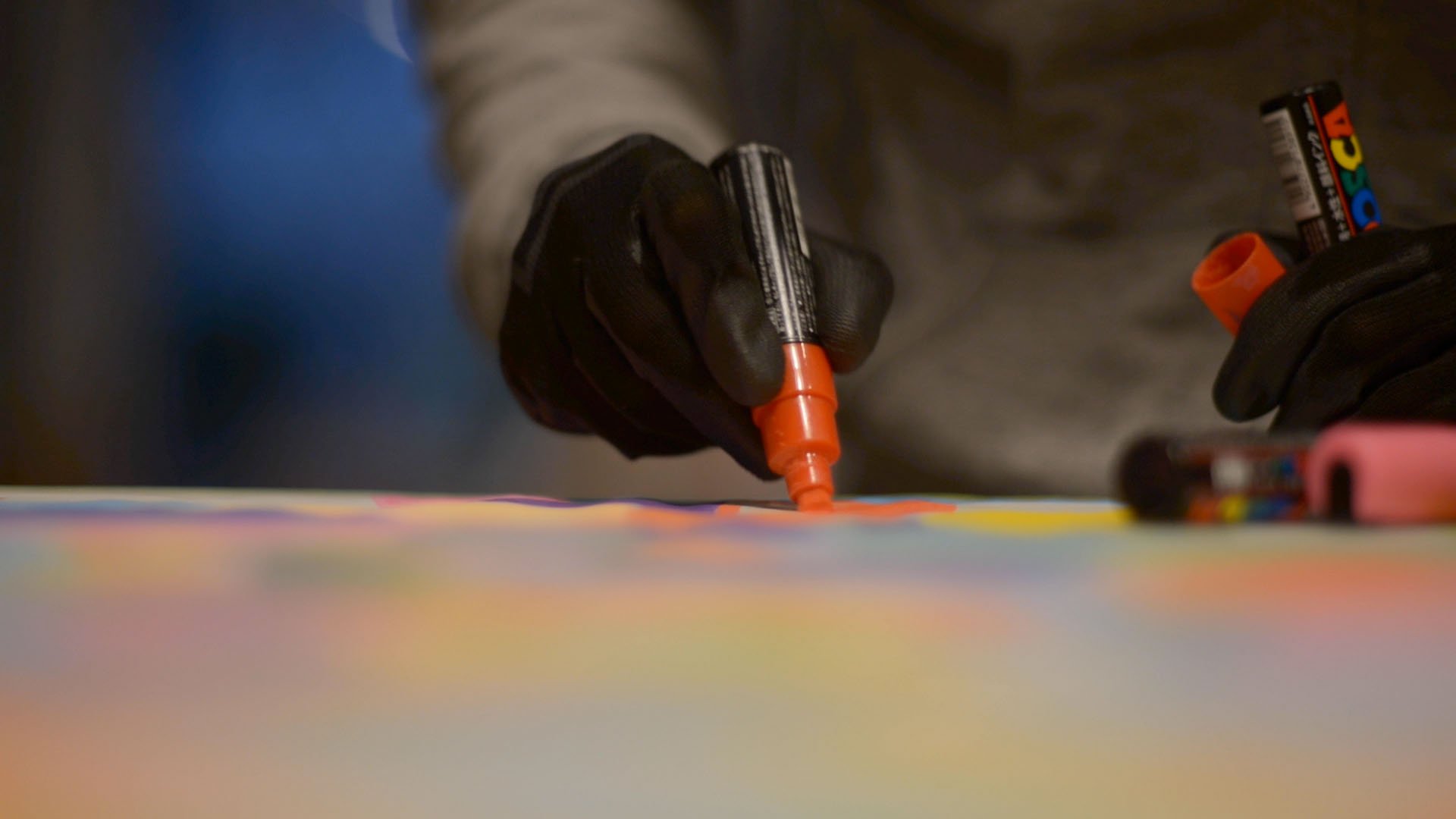
Each shape was drawn by hand creating a panorama of all unique shapes and colours to echo the dynamic nature of earthlings. Each earthling is unique.

Each shape becomes a character.
Extracted from all the unique shapes from the panoramic illustration we created a set of characters to dial up the playfulness of this brand. Each shape is unique made up of a spectrum of colours and marker doodles to echo the diversity of humans on earth.

Not one label is the same.
Each bottle is adorned with a unique label design, all extracted from the master panoramic design that was drawn by hand.

Each bottle is equipped with a fun AR component.
Scan each bottle with an AR app to bring the character to life.


Top to bottom branding assignment.

Behind the scenes in the making of the branding art for Earthling Wines from New Zealand.
FULL CREDITS
Art + Design: Chairman Ting
Illustrator: Carson Ting
Designer: Aiken Lao
Copywriter: Marcus McLaughlin
AR and animation: Mark Illing
Client: Earthling Wine @earthling.wine
