


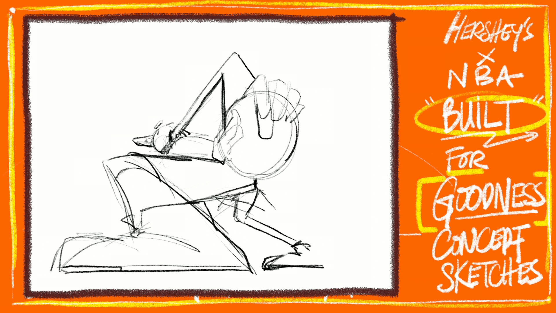


Hershey’s x NBA Built For Goodness Concept Development R2 presentation.
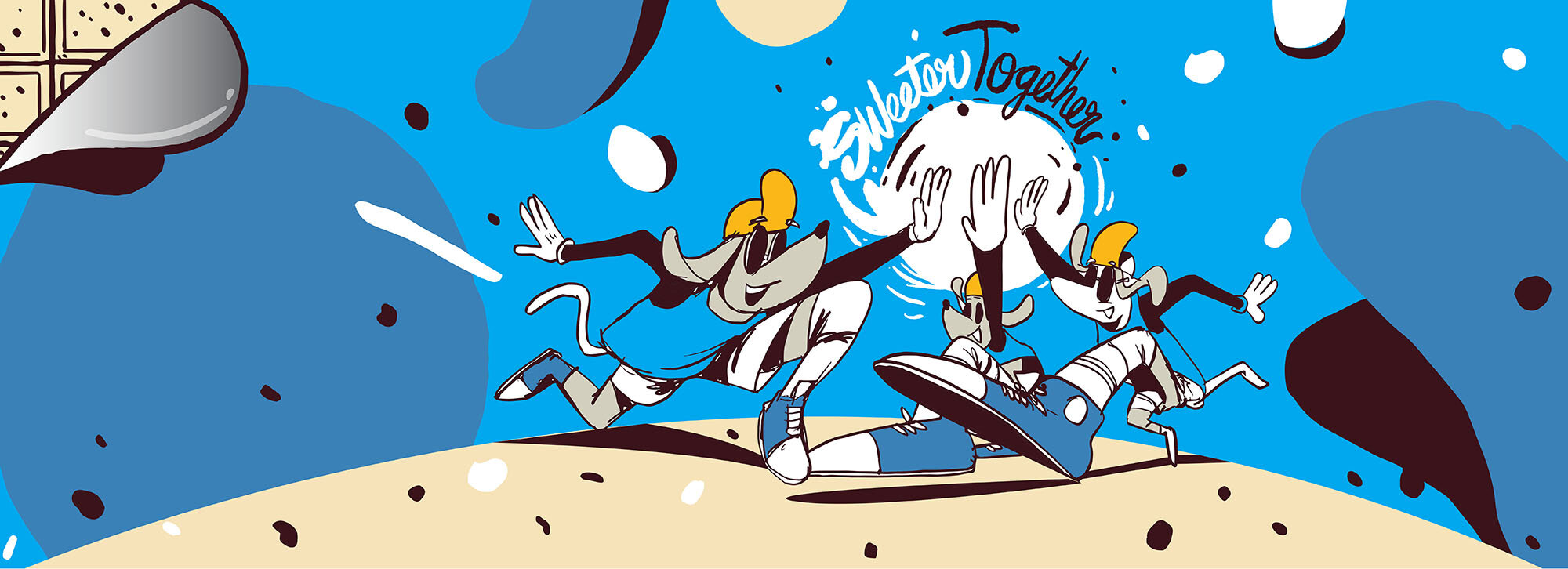
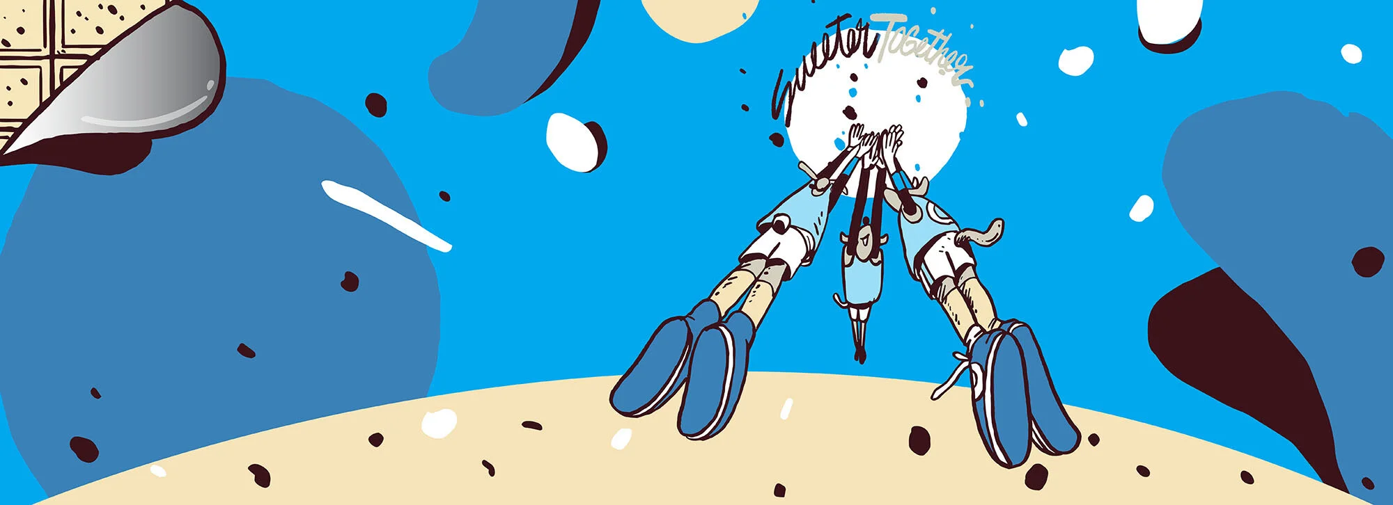
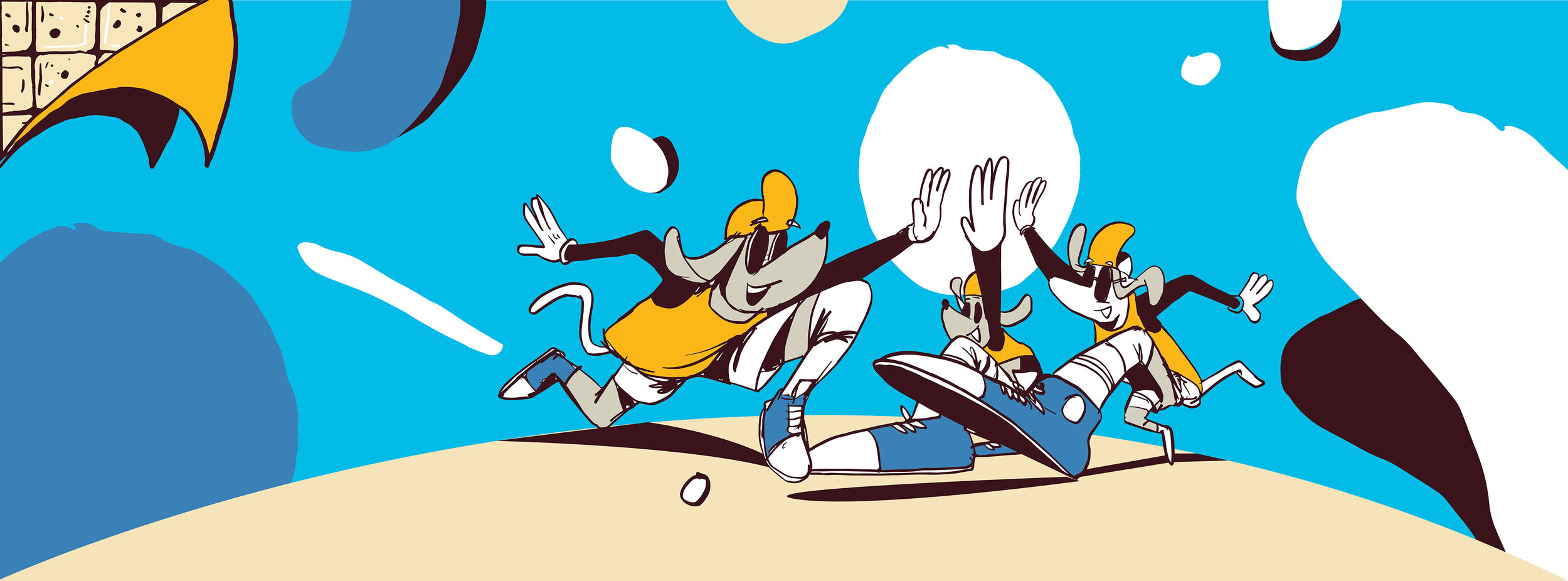
Revised work based on our last meeting. Incorporating the idea of togetherness. It is sweeter together.
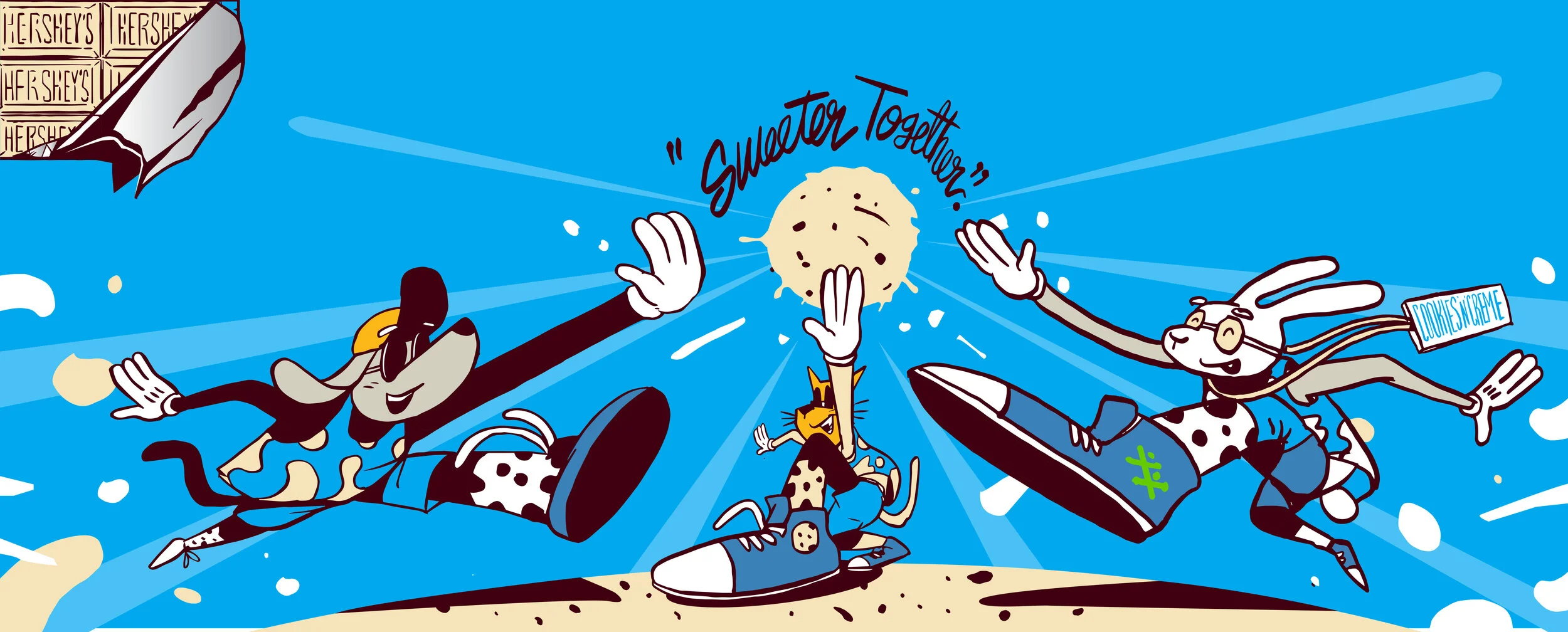
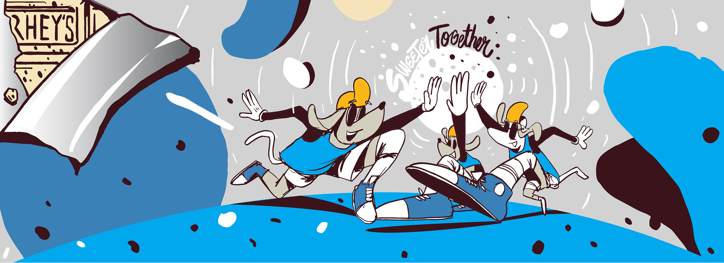
R7 - Aug 17th updated art
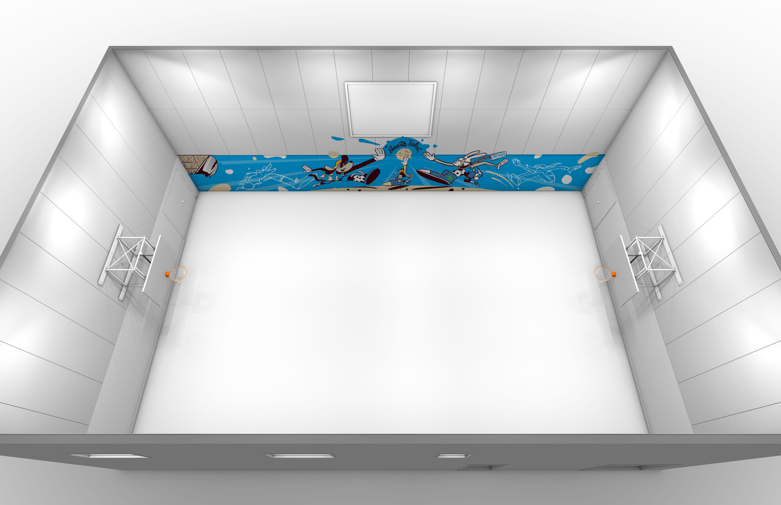
Full coverage
Changes made to the following list of requests below:
• Overall we like V1 (referenced below) – please use this version as the base and for the points below. DONE
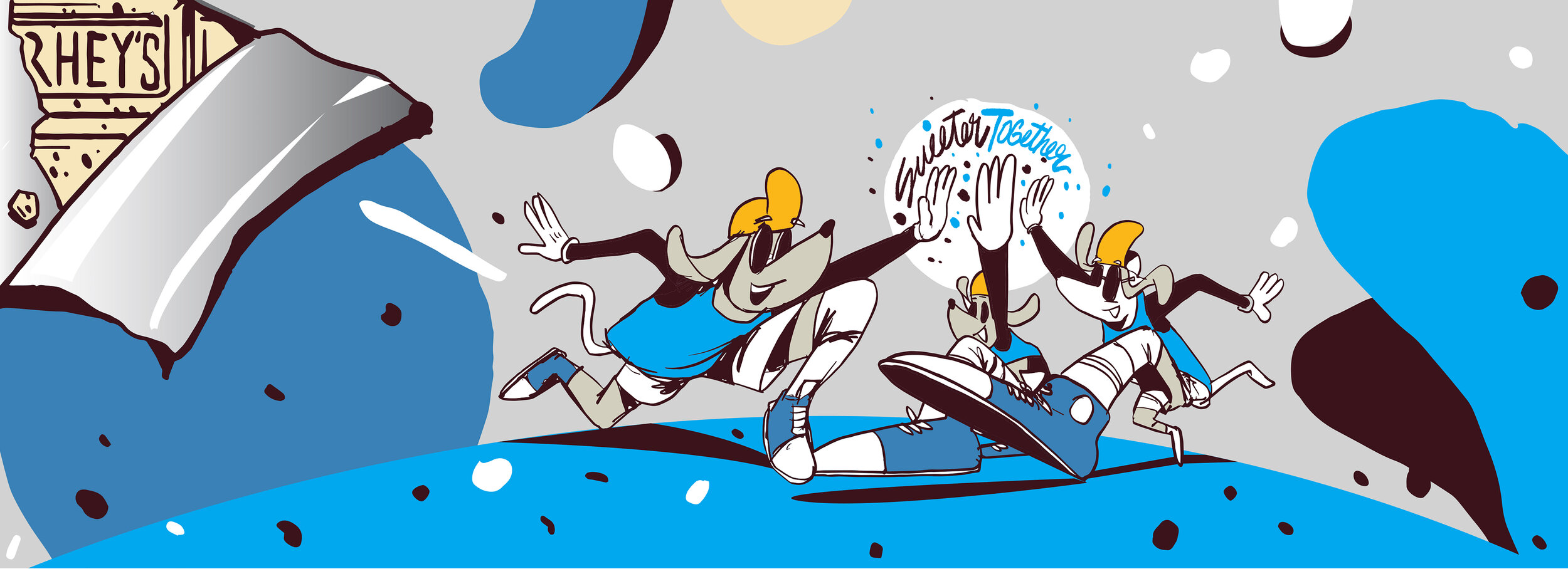
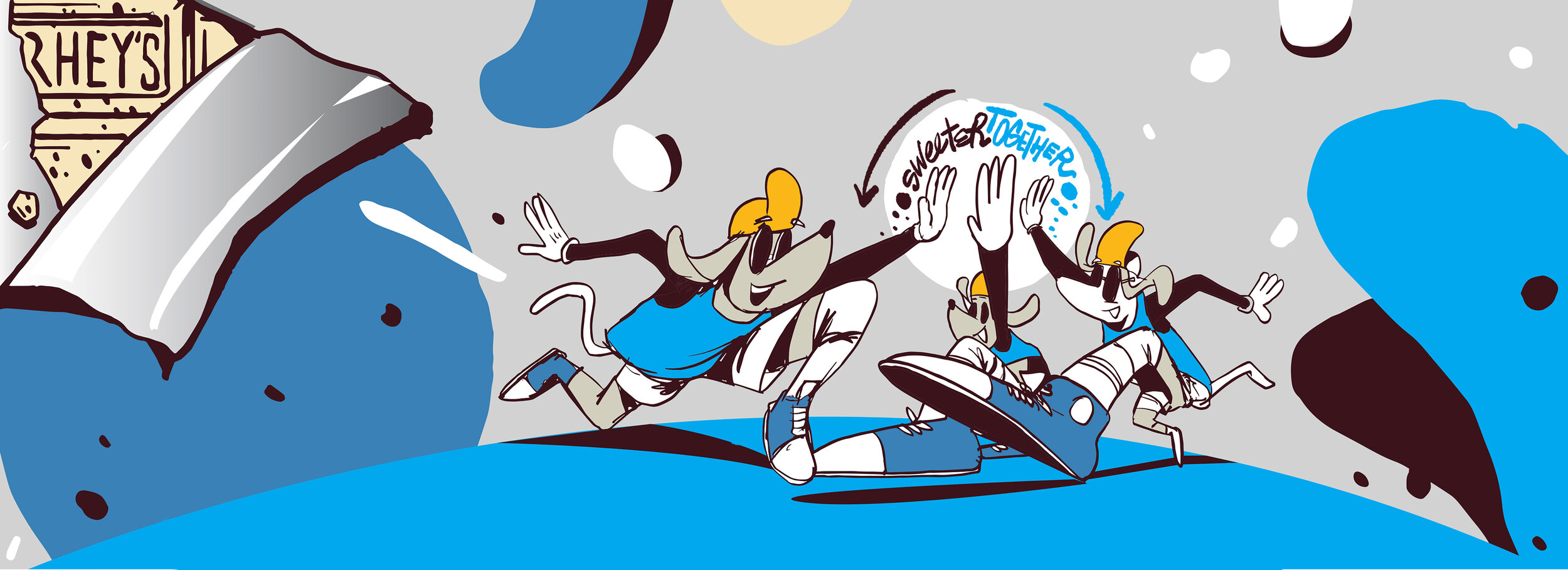
◦ Consider Sweeter Together being the same colour to ease readability DONE
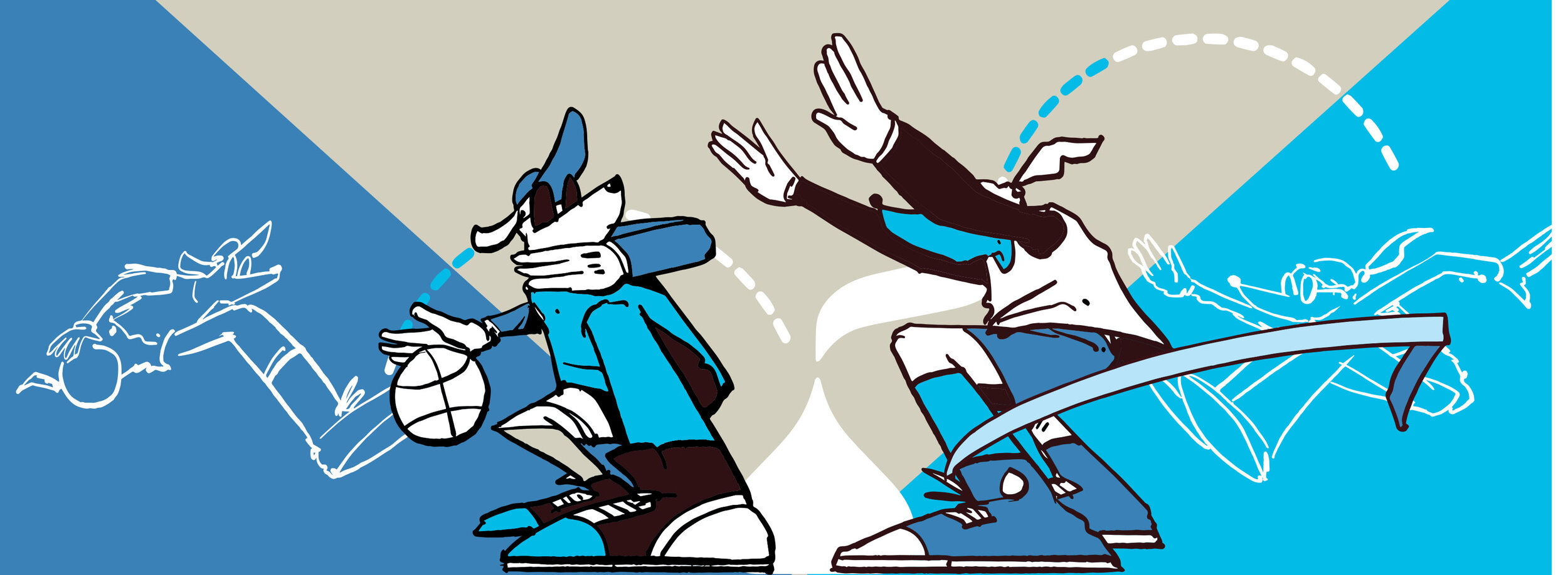
• Diversity and inclusion: there’s a good neutrality to the characters, but if they could be even more reflective of diversity and inclusion, however that can be incorporated, it would be great (i.e. different type of characters ie. dogs, cats, rabbit) DONE
• Include as much of Hershey’s workmark within the top left bar – could we have the complete “Hershey’s” name? DONE
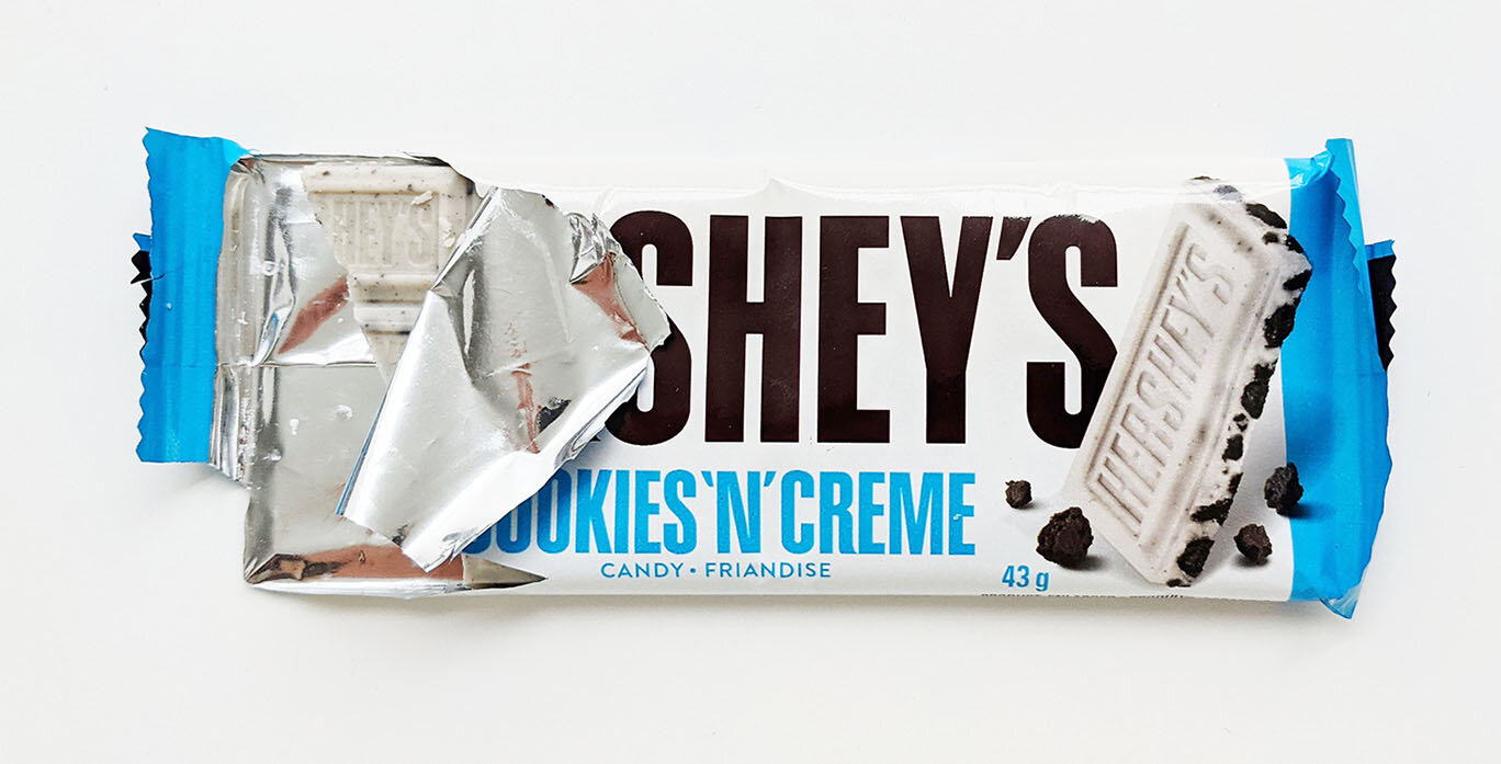
• Update wrapper for a more natural pull/rip so that it looks like when a consumer opens a bar – example attached DONE
• Consider where else the Hershey’s brand can be included (jerseys, shoes, hats, etc.) Minor revision. Did not want it to be done with a heavy hand.
• Including BGC “jacks” (attached) somewhere would be great, like on the jerseys/center court? Maintain the green colour.
DONE
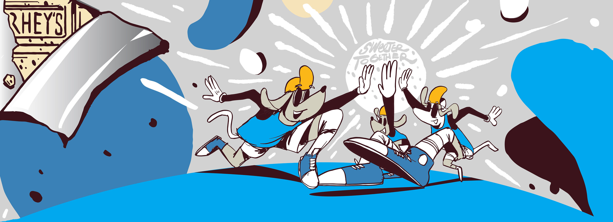
• Change all black to Hershey’s Maroon DONE
• Dial up the cream colour (within sweeter together circle) DONE
◦ Considering there is a lot of blue and not that much cream we could remove some of the blue that is not part of CNC branding (the darker blue) and replace it with cream. DONE
◦ Blue background: We can change the white and larger spots to cream and change the smaller spots to maroon DONE
◦ Cream background: change white spots to maroon so that all look like cookie pieces DONE
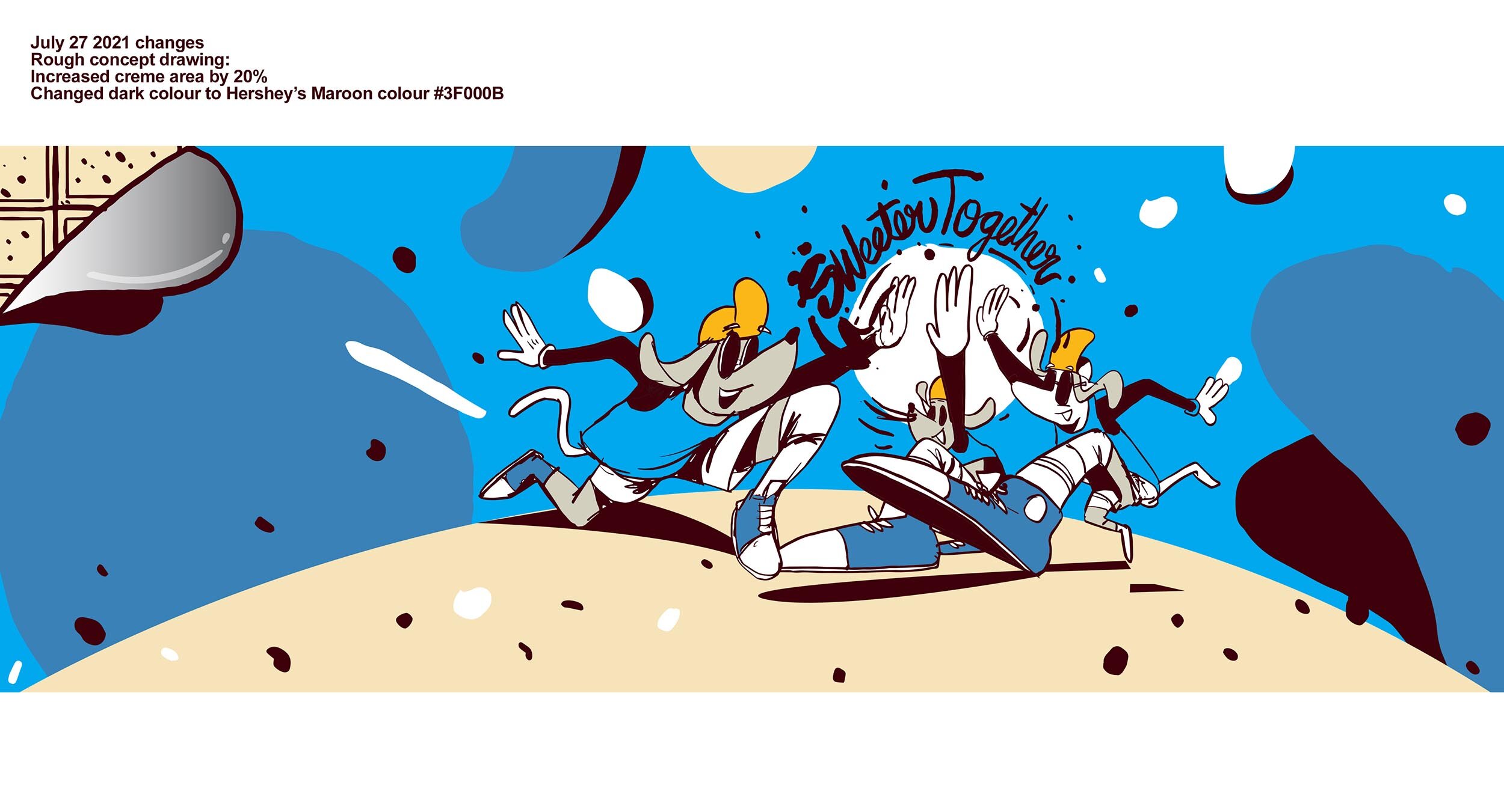
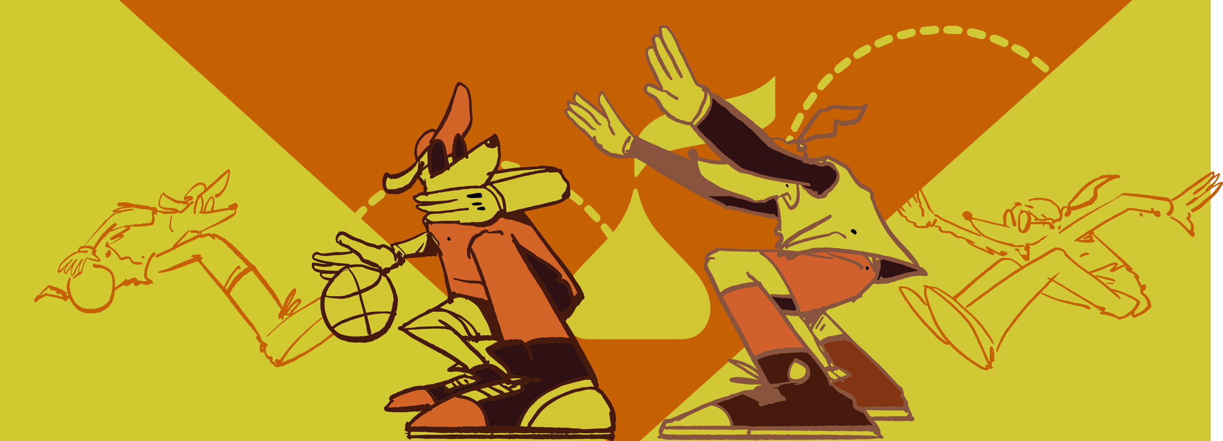
Rough concept drawing: Increased creme area by 20% Changed dark colour to Hershey’s Maroon colour #3F000B
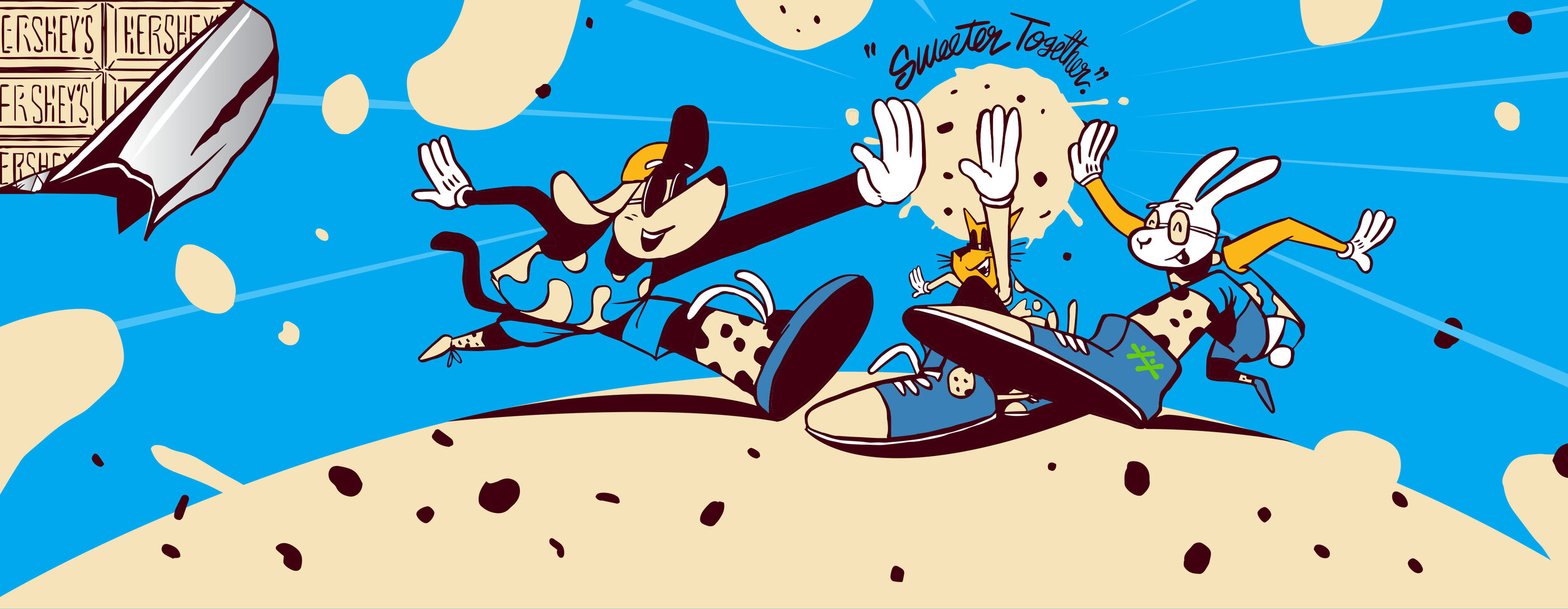
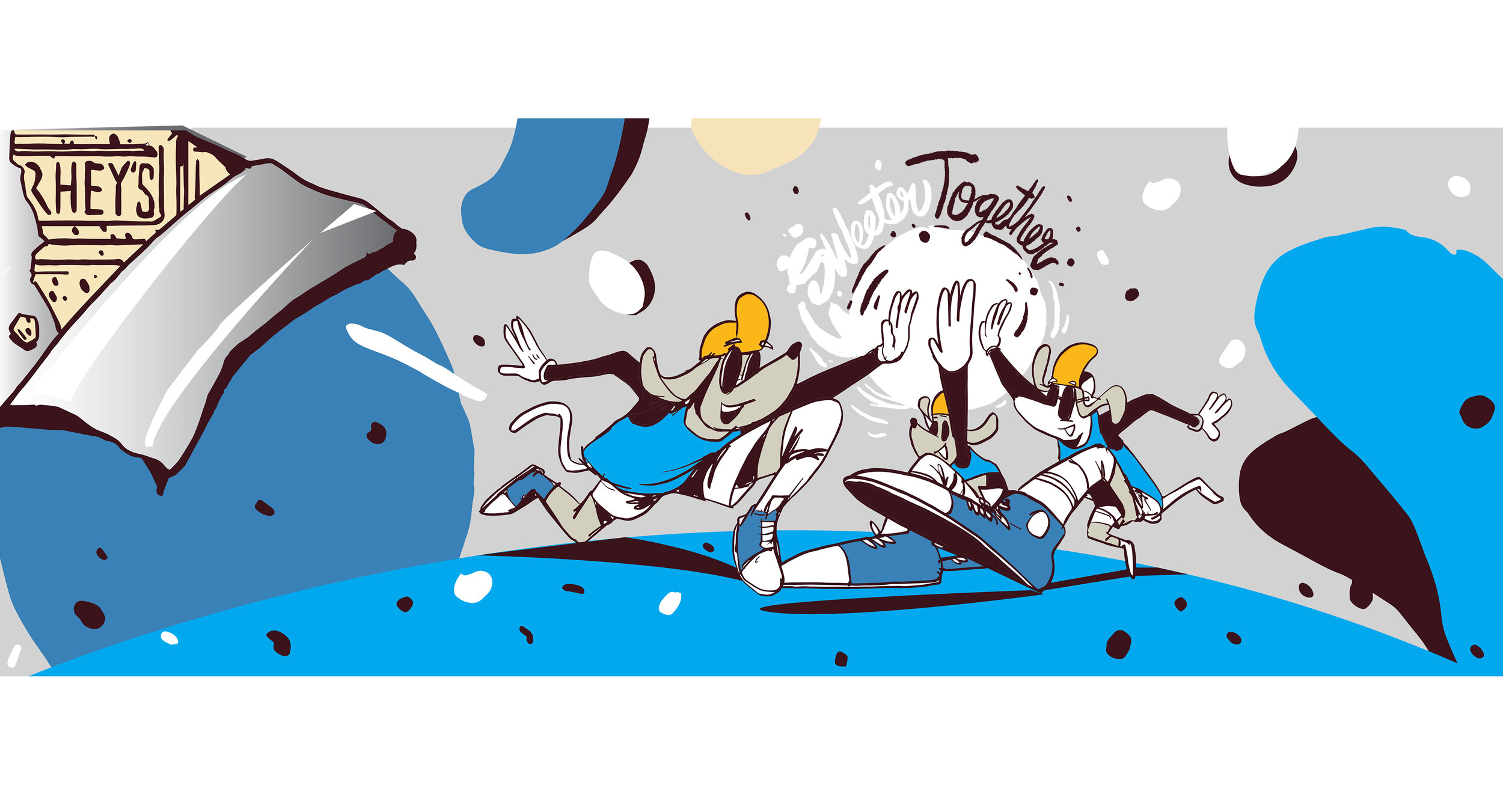
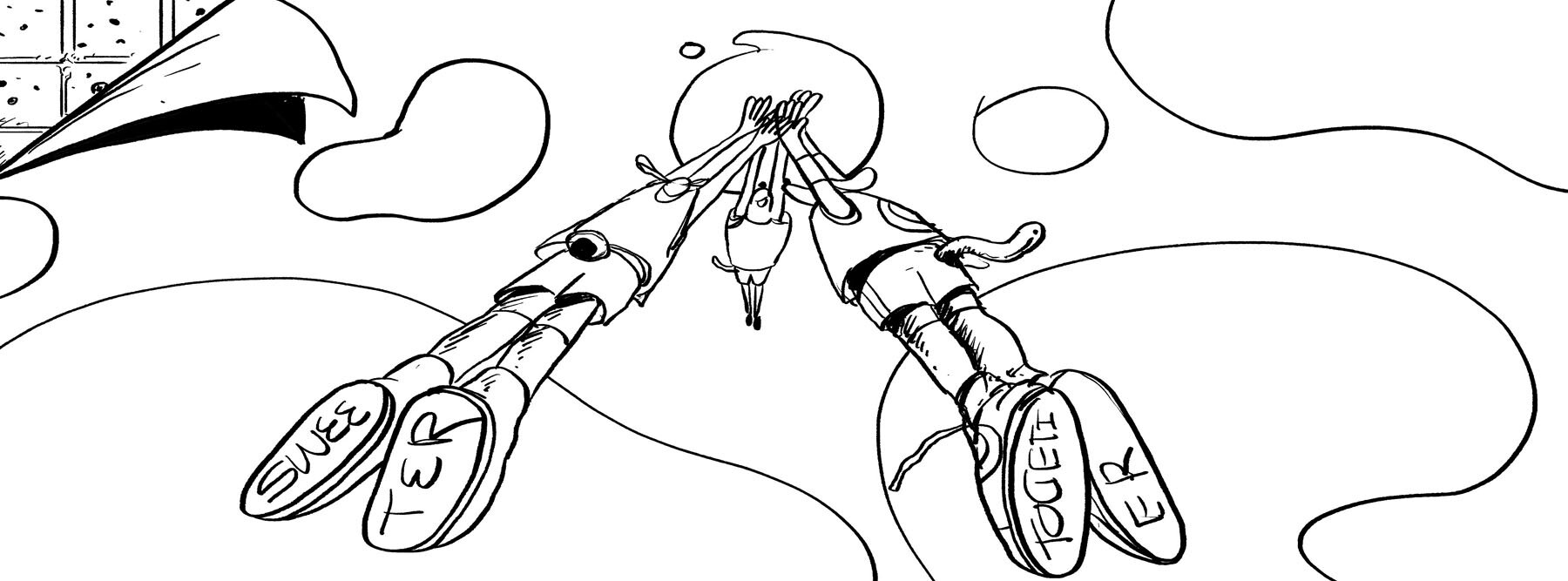
Rough concept sketch. This includes the idea of peeling back the wrapper to reveal the goodness underneath.
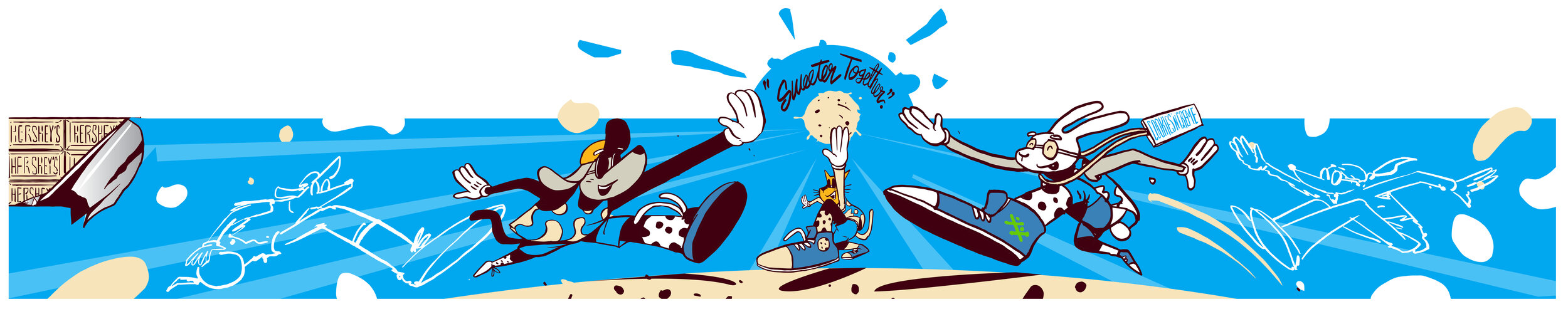
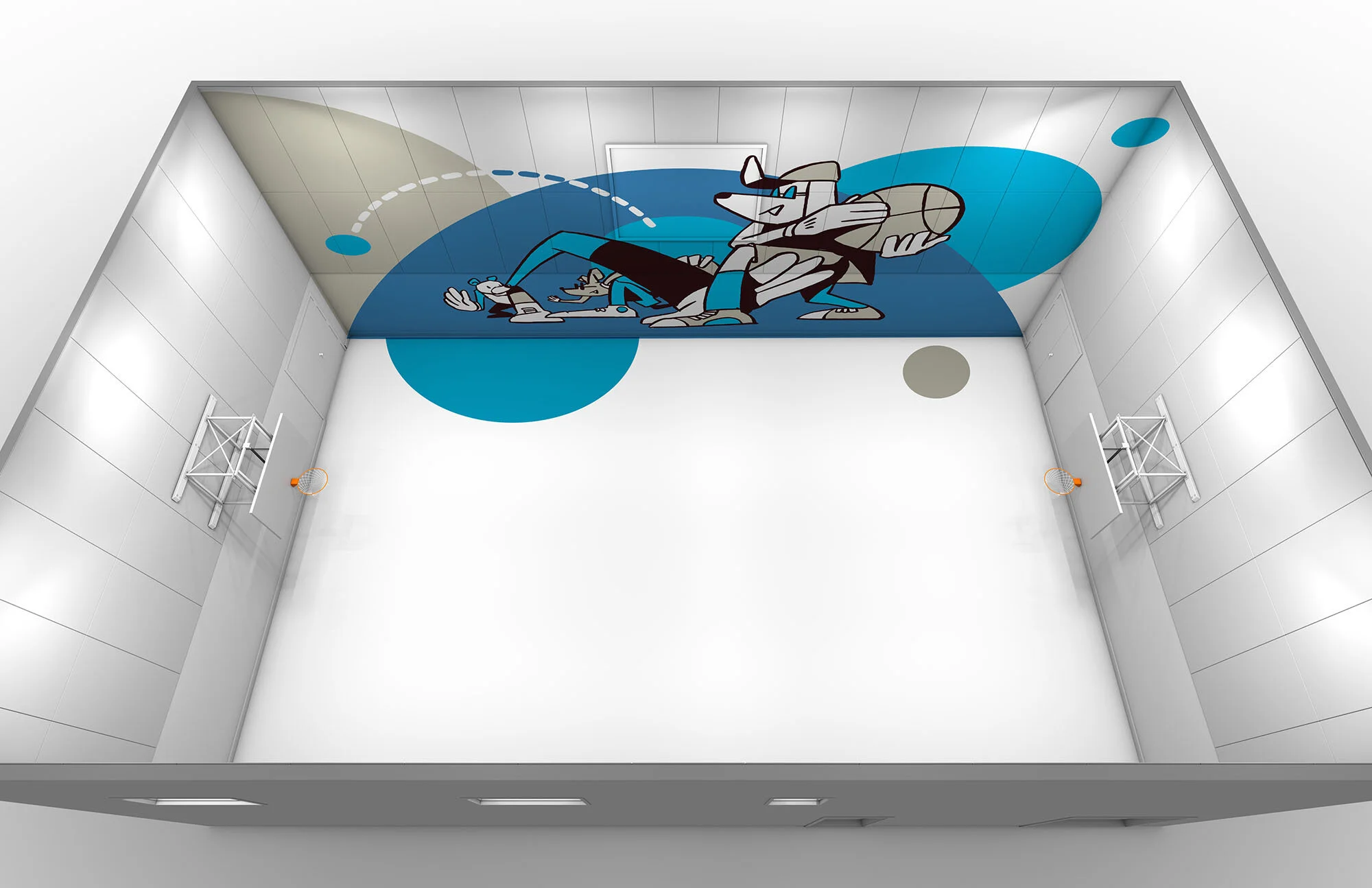
An alternate look at the cosmic high-five visual concept.
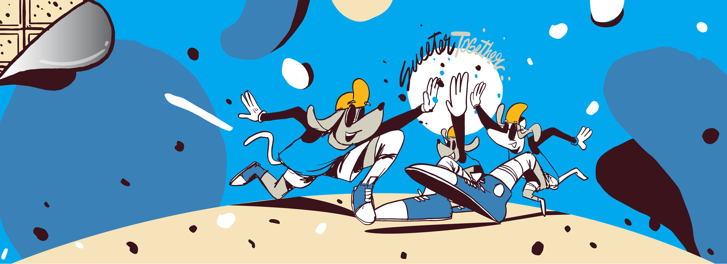
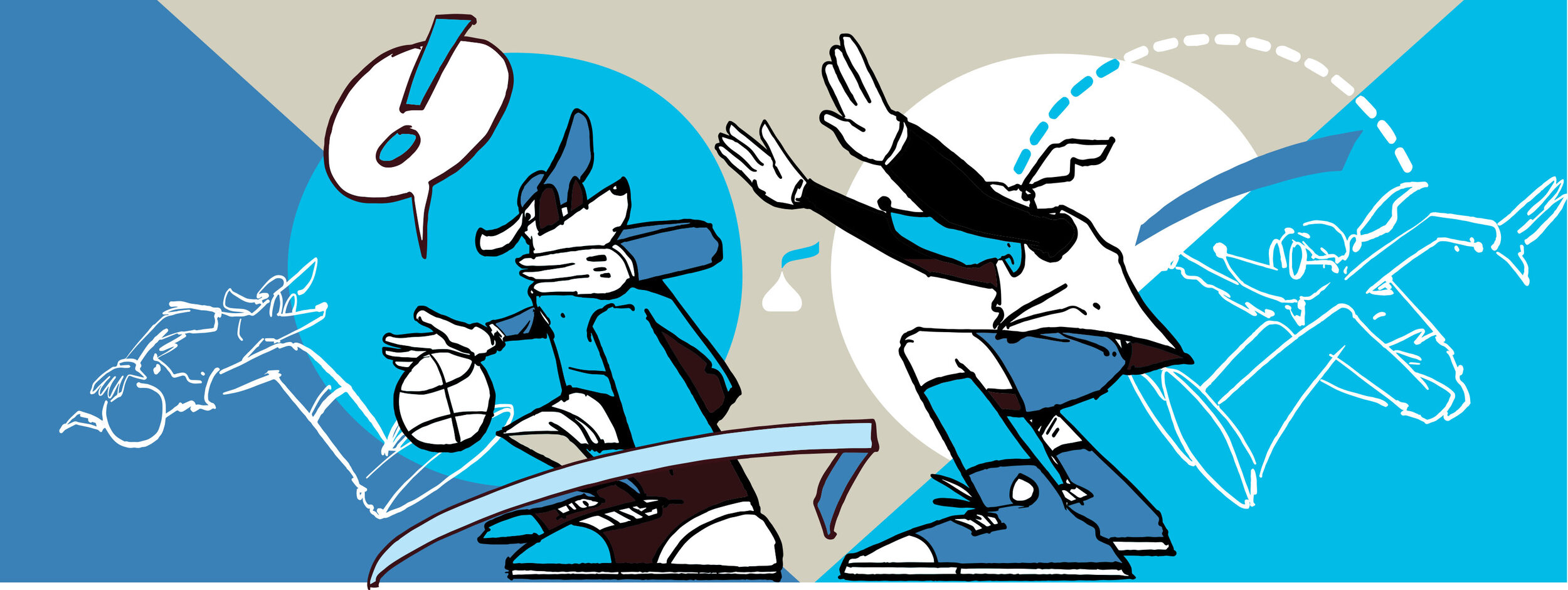
The quick gestural drawings can look quite stunning on it’s own leading up to the feature pieces in full colour.
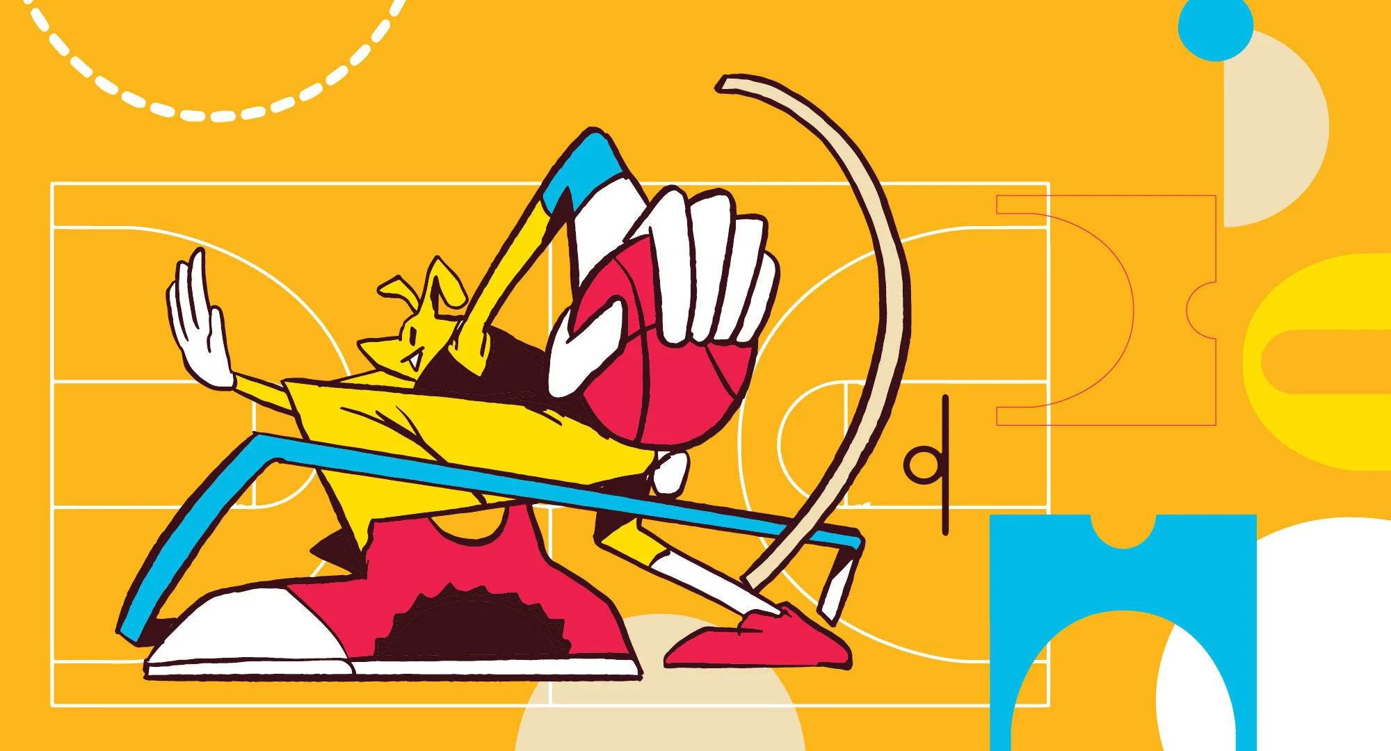
A quick gestural sketch to show initial thought process.
A quick look at my creative sketching development phase.